Recently, I’ve done some research and looked at a few strategy games to get an idea about the elements of the interface. We’ve all played mobile games, but not always paying attention to the important details.
From own experience, the interface is one of those elements, which aren’t often appreciated. But if it’s bad, it will definitely get our attention. In the wrong way. The interface shouldn’t require much of a thought from the user and remain not only intuitive, but also appealing.
I looked up an article about the best strategy games for 2017 (http://www.tomsguide.com/us/best-ios-games,review-2717-3.html). In this case, I only focused on the main building screen for now. Apps such like “Megapolis”, “Legends of Callasia”, “Civilization Revolution II” and “Warhammer 40k: Armageddon” helped me to get a better understanding of what’s important for the user. My game will most likely be more simple than most of these, so I decided to implement a minimalistic menu.
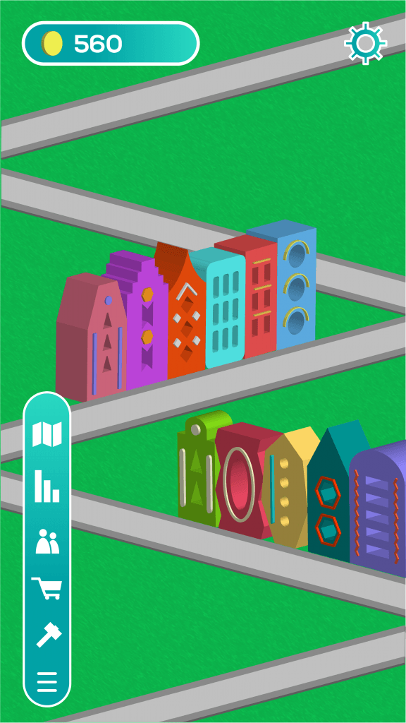
In the top left corner there will be an information about the amount of coins that the user has, and next to it, a cog which opens the settings and the menu.
In the bottom part of the screen, there will be a slider button, which tapped, shows icons for the shop, stats, social tab and events, exploration of other cities, and an option of creating your own building. My original idea is a simple blue gradient with a subtle outline. I think it fits the style of the app well and adds a bit of variety to the screen.
The option of building your own structures is something that I came up with recently. Instead of only making ready-made buildings, you can invest in your own ideas and make the city even more unique.
